Visual Identity
2021

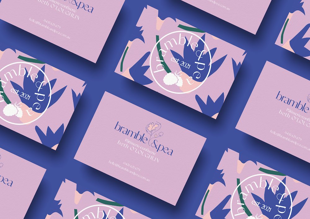
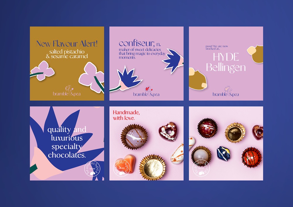
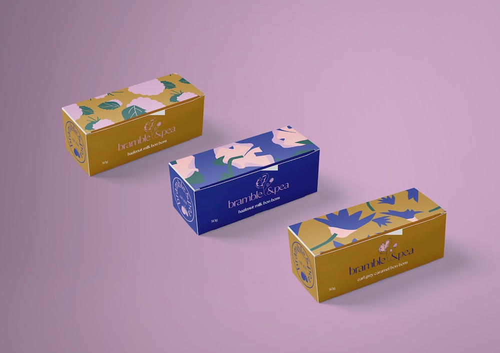
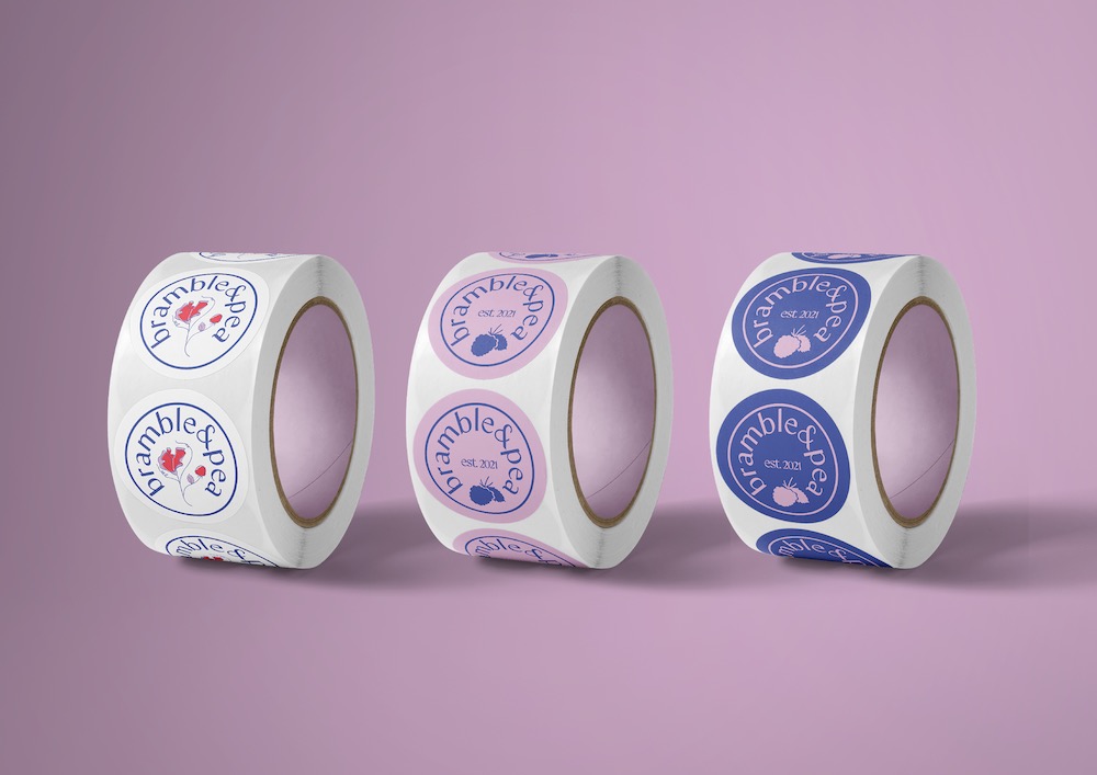
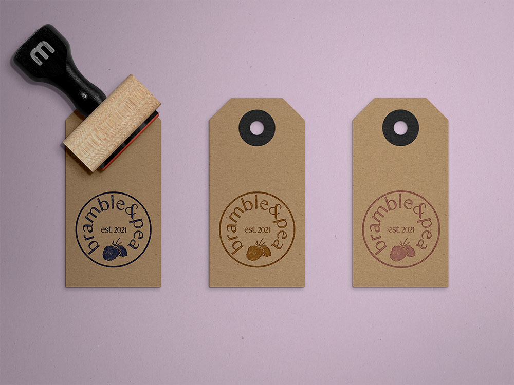
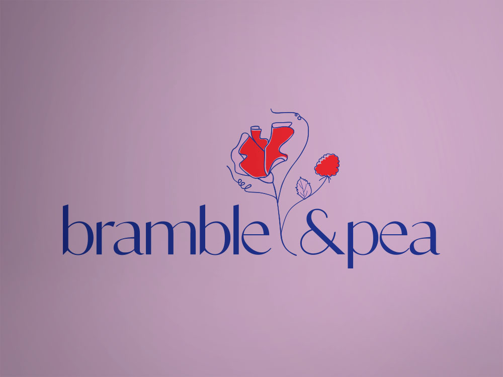
Bramble&Pea is an emerging handmade artisan chocolate brand based on the NSW mid-north coast. Beth O’loughlan, an experienced and highly talented pastry chef, sits at the helm of this new venture. Her aim is to create a range of high end, delicious, moreish and lusted after chocolates. Our aim is to craft a brand that matches her passion and enthusiasm and pulls in potential customers with spectacular visuals that align with Beth and Bramble&Pea.

Pretty Bird was tasked with crafting a brand that will;

  • align with Bramble&Pea and the brands values
  • reflect the luxurious and high-end qualities of the chocolate products
  • add to the unique value proposition of Bramble&Pea
  • bring legitimacy and professionalism to the early stages of business development
  • communicates with their ideal customer and create brand association and awareness 
  • The new brand will be relying on strong strategy and research and will:
  • differentiate Bramble&Pea from its competitors
  • be flexible enough to evolve as the brand develops and grows
  • sit comfortably between a timeless yet modern overall aesthetic 
  • Above all, Beth needs to love this brand and feel that it reflects her and her personality. 

“Sam at Pretty Bird created the most amazing logo and brand identity for me. The process from start to finish was clear and easy and all of the work professional & prompt.”